ICHIBUNS
ICHIBUNS
Matcha.xyz
Brand Design

Smooth Swaps
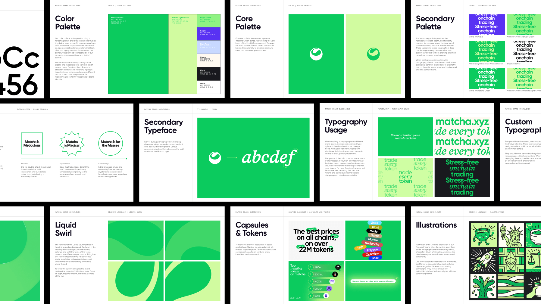
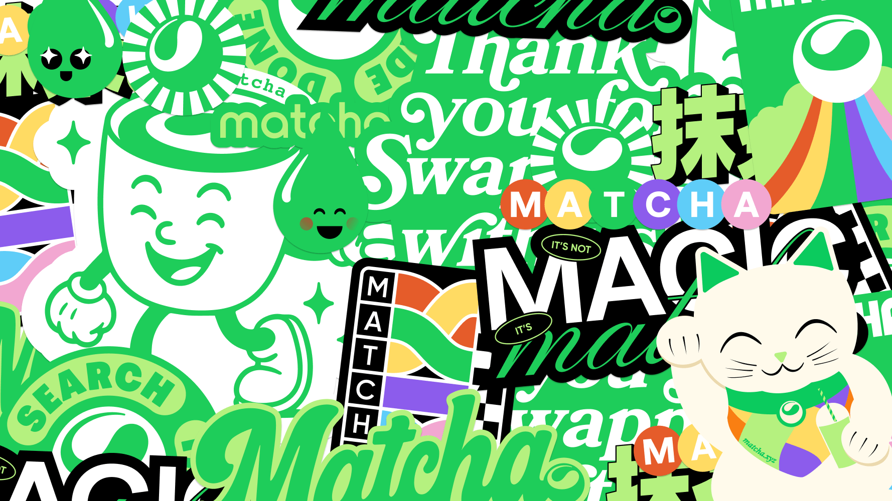
Matcha.xyz is a DEX aggregator that helps traders find the best prices across millions of onchain tokens. It's pioneering user-friendly features simplify a fast-moving, complex landscape. Capitalizing on their unique name, there was an opportunity to amplify the brand around its frictionless user experience. The goal was to build a distinct, trustworthy identity that leaned into the calming qualities of matcha and stood apart from a sea of look-alike DeFi platforms.
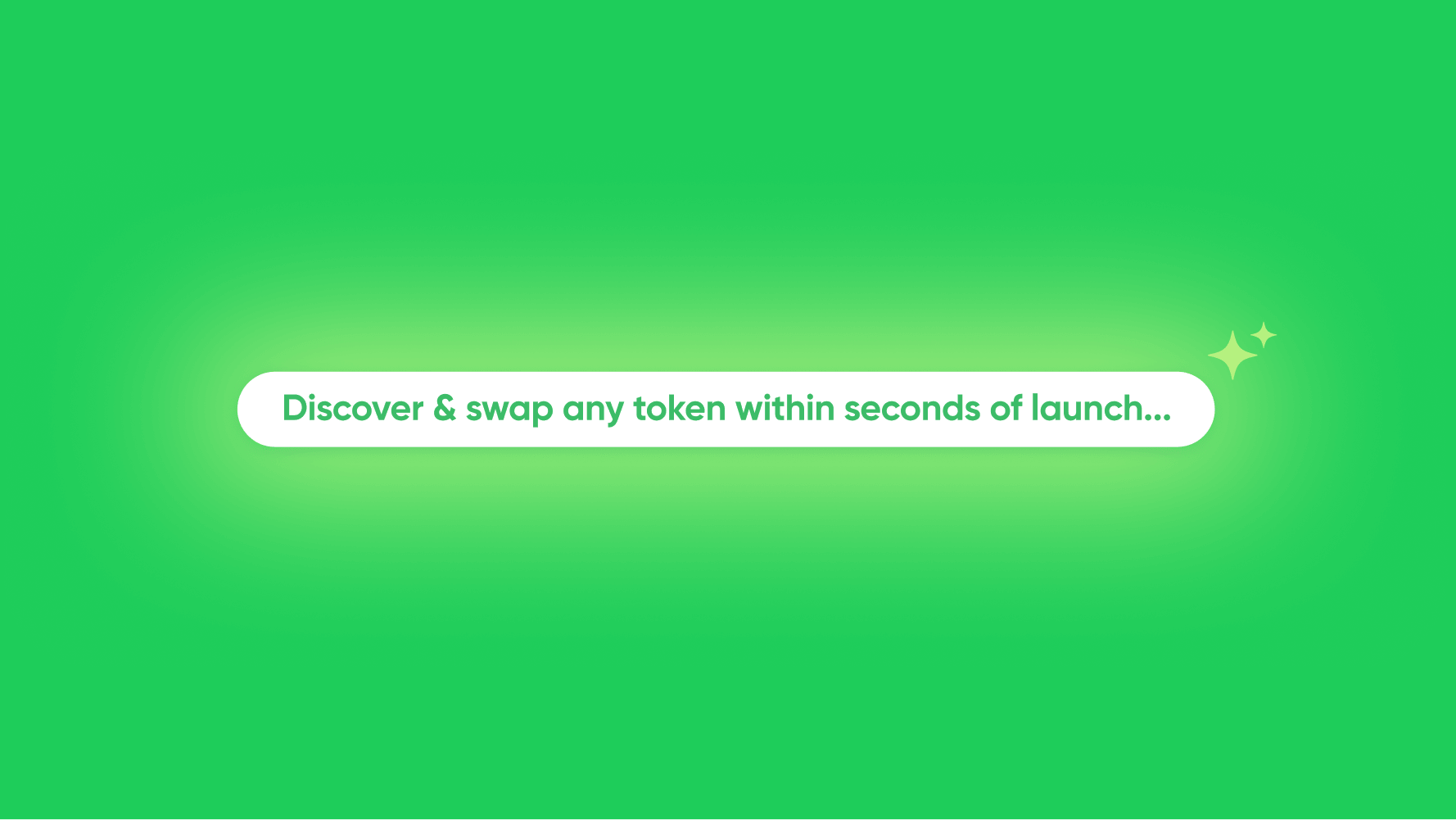

The identity leans into the characteristics of the drink itself. A vibrant hero green pairs with a smooth, fluid visual language that flows naturally from the iconic swirl logo. The result is a distinctly characterful brand whose warm personality reflects the meticulous care and thoughtfulness embedded in the product.





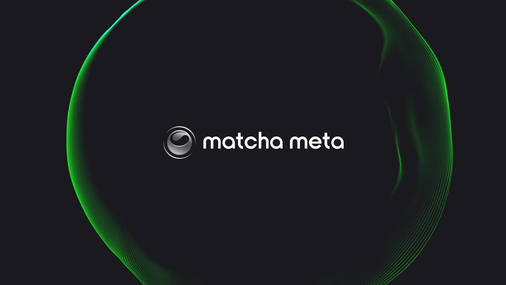
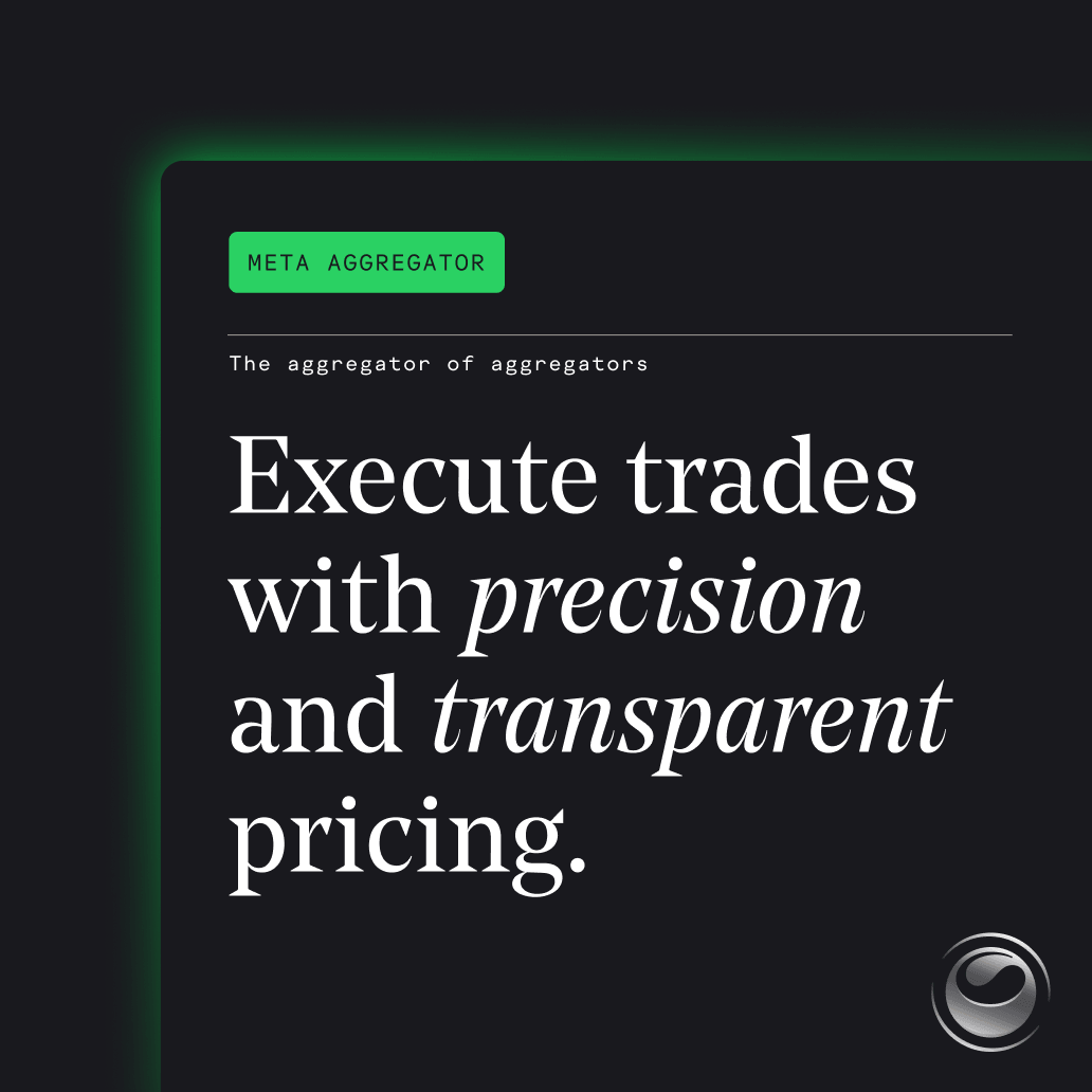
As the brand expanded into a broader ecosystem, the challenge was to maintain visual continuity while carving out a distinct sub-identity. For Matcha Meta (a meta-aggregator), the product focus shifted toward high-speed execution and technical precision. This materialized as a darker, moodier aesthetic that highlights the versatility of the original Matcha brand DNA. The logo introduces sharp, metallic details, while the recognizable green swirl is reimagined as a sophisticated, ambient orb.

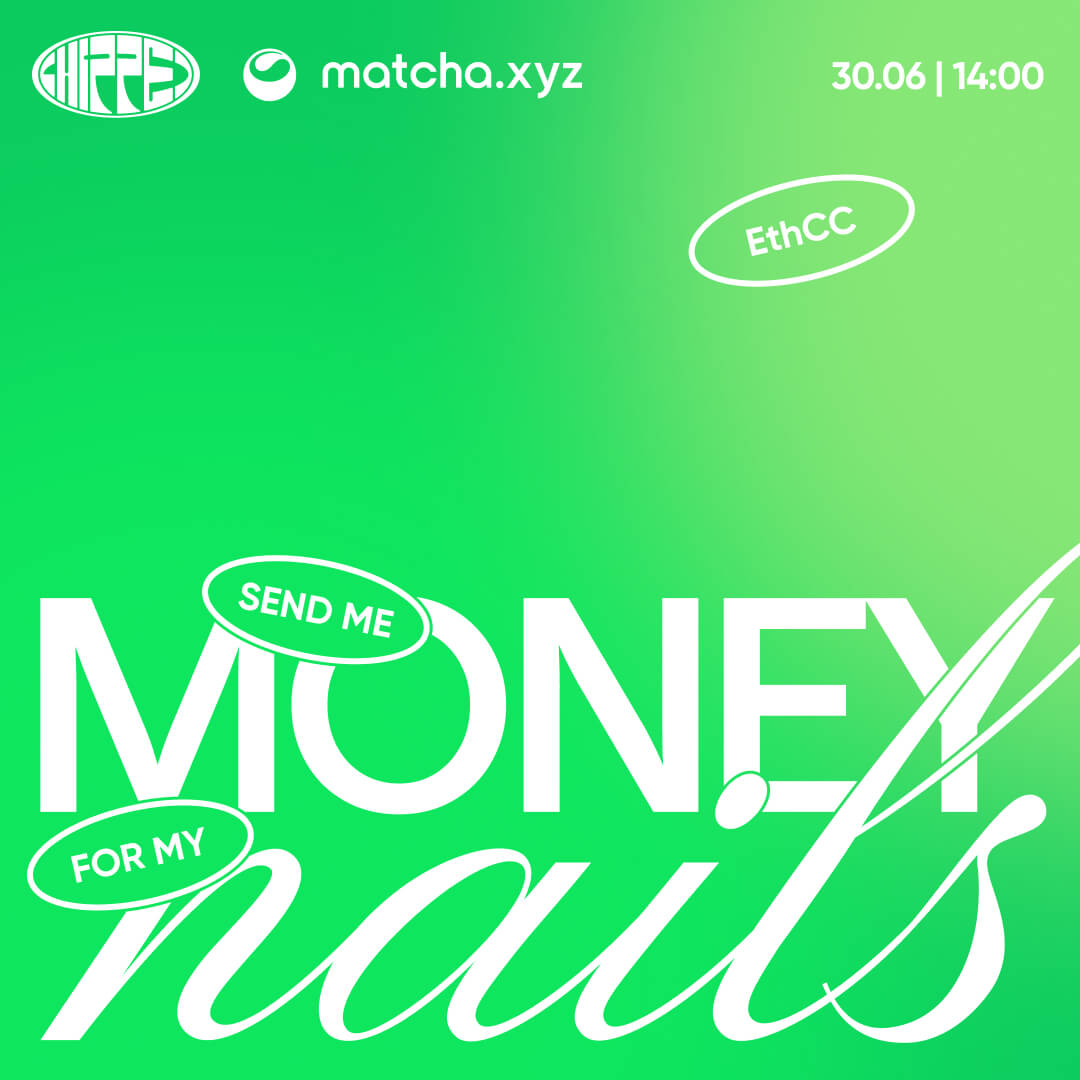
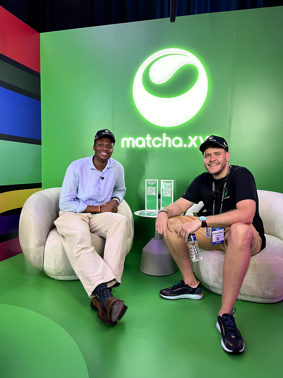
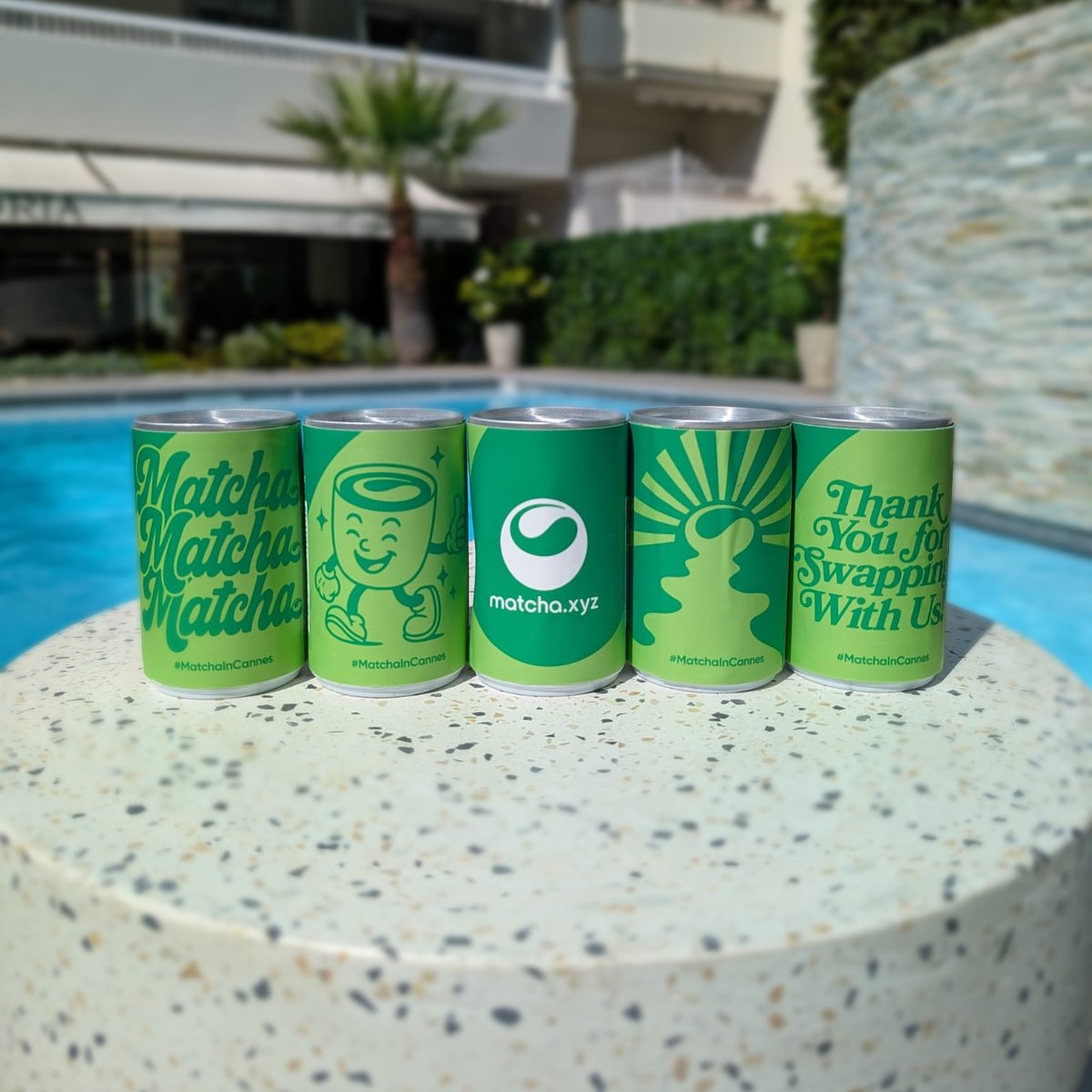
Global conferences provided an ideal space to bring Matcha’s playful energy into the physical world. The brand adapted effortlessly across different environments, from the rugged outdoors of EthDenver to the refined sophistication of EthCC Cannes. The brand presence was instantly recognisable. The vibrant green palette cut through the noise of competing booths. On top, matcha carts and bars became focal points for attendees and added a warm, memorable experiential layer.